
| Entry Assignment: Be ready to take notes. |
Why are Fonts Important?
Choosing a font is an important decision in desktop publishing. You can’t just pick any font, because we make natural associations with fonts. Certain fonts remind us of certain things.
Choosing a Font
Since fonts often have natural associations, it is important to choose a font that communicates the right message.
What message do each of the following fonts communicate?


Bad Font Choices
Some fonts are poor choices for the way they are used. What is wrong with the following font?

Choosing a font that is less common may help you attract attention. As with the following font, some choices are overused and lose their fresh appeal to people.

Serif and Sans Serif Fonts
Look at the following two fonts and guess what the main difference between them is.
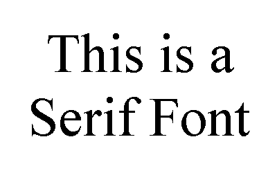

Can you tell what the main difference between these two types of fonts is?
A serif is a small decoration on the ends of a letter. Therefore, serif fonts have small decorations on the ends of the letters. Sans-serif fonts do not; they are straight-edged.
| Serif Fonts | Sans Serif Fonts |
|
|
General Guidelines
Use the following general guidelines when choosing a font:
- Choose an appropriate font.
- Easy to read (not too decorated)
- Good size (newspaper size is between 9 and 12 point font)
- Don’t write in all caps (hard to read)