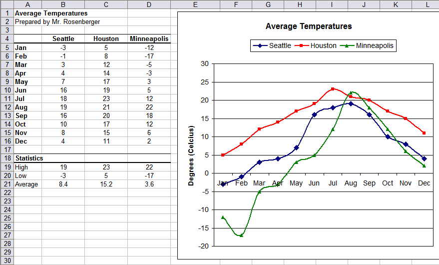
Directions
Use the following guidelines to create a line graph of average temperatures in three major cities.
- Go to Workgroup — Classes — CompApps — Calc and open a copy of Temperature and save a copy in your CompApps folder.
- In cell A1, type “Average Temperatures” in bold text. In cell A2, type “Prepared by” with your name.
- In cells A4:D16, type the table of numbers as shown in the example.
- Bold, center, and add borders as shown.
- Adjust the column widths, making sure to keep columns B-D the same width.
- Add the table of statistics in cells A18:D21, using formulas with functions to compute the numbers.
- Format text and numbers as shown in the example.
- Highlight cells A4:D16 and click the Chart Wizard button.
- Step 1: Select “Line” chart type and use the “Points and Lines” sub-type (not stacked line).
- Click on Step 4 and set the chart title to “Average Temperatures” and the Value (Y) axis label to “Degrees (Celcius).” Change the legend placement to Top and click Finish.
- Format the Plot Area and make the background white. Format each of the plots to make the lines thicker to 0.10 inches. Change the lines and markers for Houston to red, Seattle to blue, and Minneapolis to green.
- Make sure the page orientation is set to landscape.
- Page preview and return to the normal view. Using the handles, resize the chart so that it fills the remainder of the page and everything fits on one page. Page preview again to verify that it fits and fills the page.
- Save the modified file.
- Raise your hand and ask your teacher to grade your spreadsheet on screen.
Example