Directions
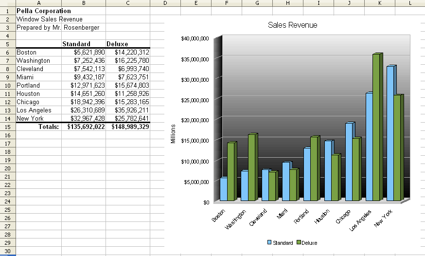
Use the following guidelines to create a bar graph of Pella Corporation window sales revenue in major cities.
- Go to the Workgroup — Classes — CompApps — Calc and open a copy of Revenue and save a copy in your CompApps folder.
- Bold cell A1. Update cell A3 to include your name.
- Select A6-C14, and Sort Column B by Ascending.
- Format the table in cells A5:C14 as shown in the example. Be sure to use currency with no decimals.
- Add borders above and below the table.
- Add the totals line as shown in the example, using formulas to compute the numbers. Format as shown.
- Highlight the table (but not the totals) and click the Chart Wizard button.
- Step 1: Select the first “Column” chart type and check for “3D look” then move to step 4 of the Chart Wizard.
- Step 4: Set the chart title to “Sales Revenue.” Set the Y-Axis Title to “Millions.” Change the legend placement to Bottom. Click Finish.
- Change the page orientation to landscape.
- Page Preview and close the preview to see the print boundaries. Then move and enlarge the chart so it fits on and fills the page.
- Change the colors of data series to light green and light blue. Change the background color of the chart (Chart Wall) to be a gradient.
- Format the X Axis, so that the text is at a 45-degree angle (and is overlapped) under the Labels tab.
- Save the modified file.
- Raise your hand and ask your teacher to grade your spreadsheet on screen.
Example

